Objective
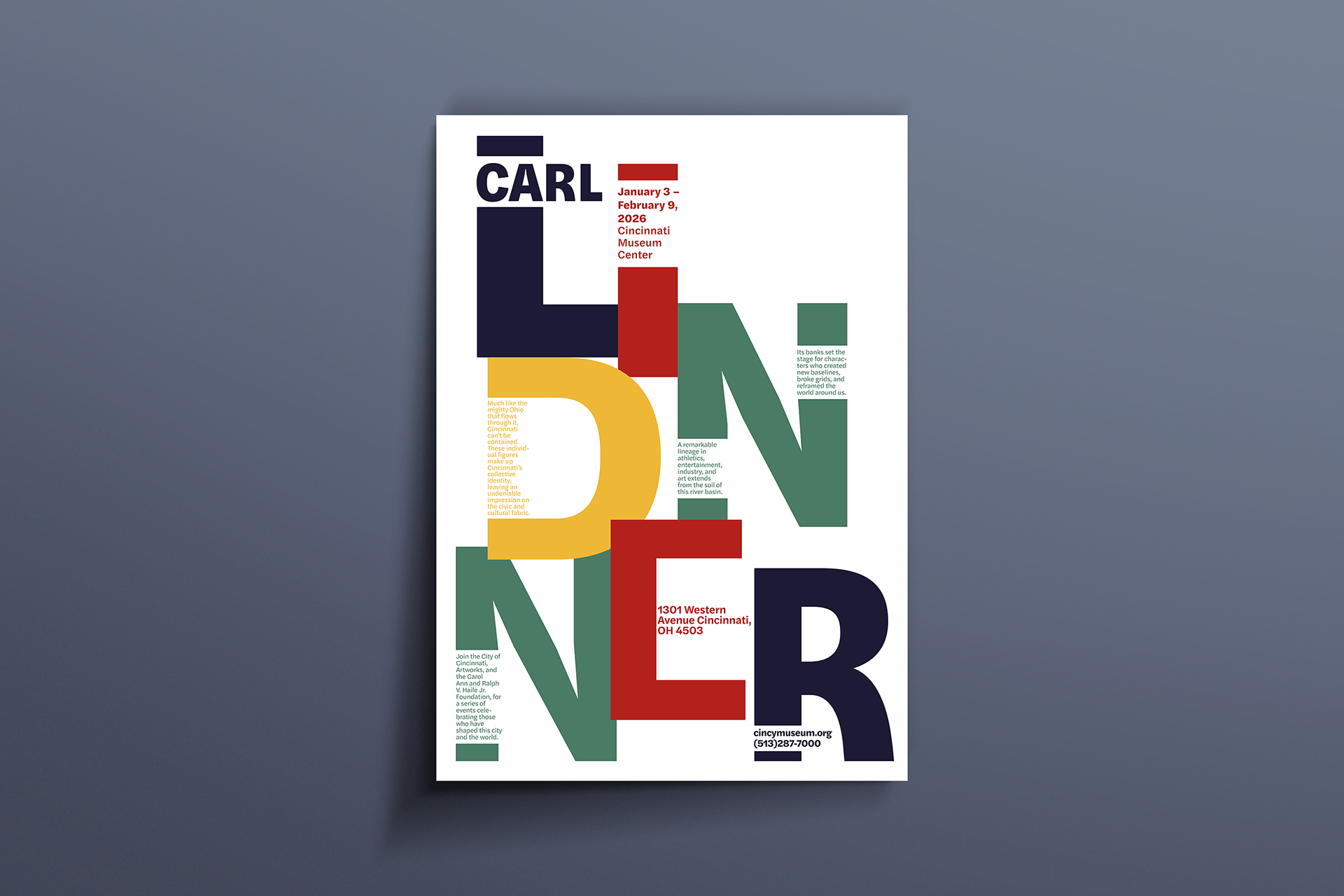
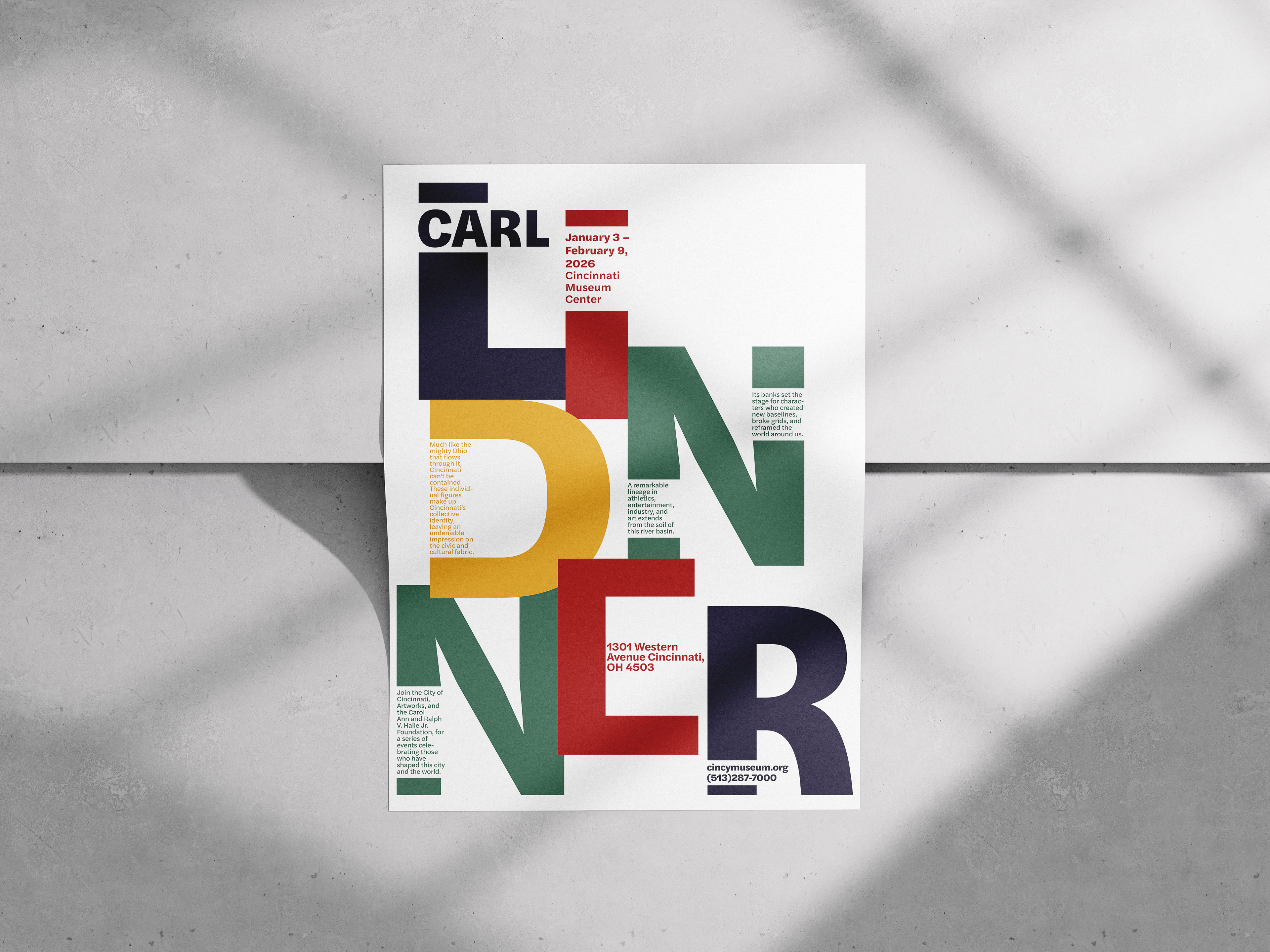
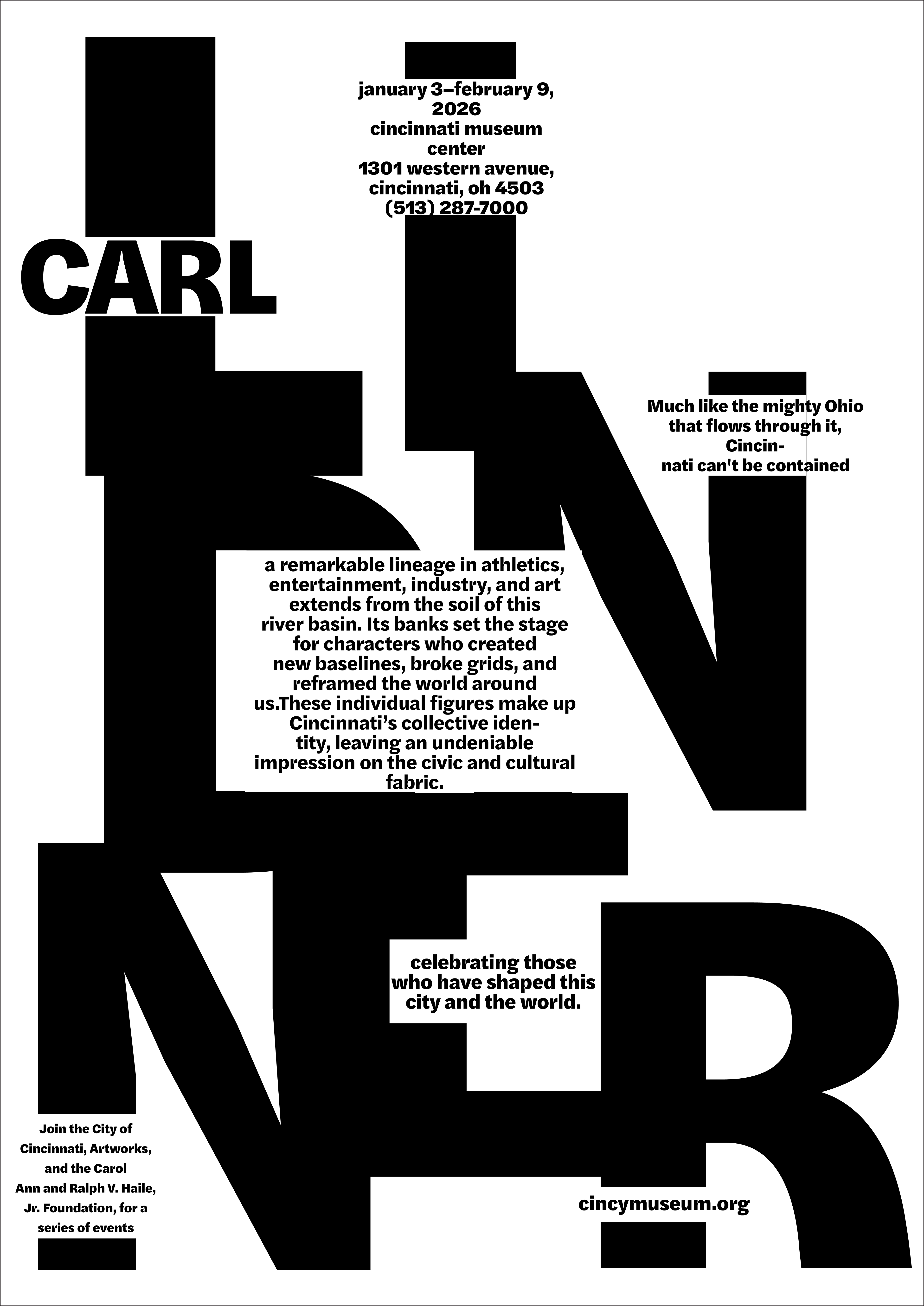
This project focuses on creating a typographic poster that visually communicates the contributions of a person’s work while establishing a clear hierarchy and engaging visual system.
Person chosen: Carl Lindner
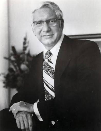
After thorough research, I selected Carl Lindner to base my project off of. Carl Lindner was a Cincinnati businessman and entrepreneur who became one of the city’s most influential business figures. He began working in his family’s dairy business as a teenager and with his siblings, helped build United Dairy Farmers. His legacy is carried on at the University of Cincinnati with the business college being named after him, alongside many other honors. In my designs I want to reflect his professionalism and sophisticated work.
Sketches
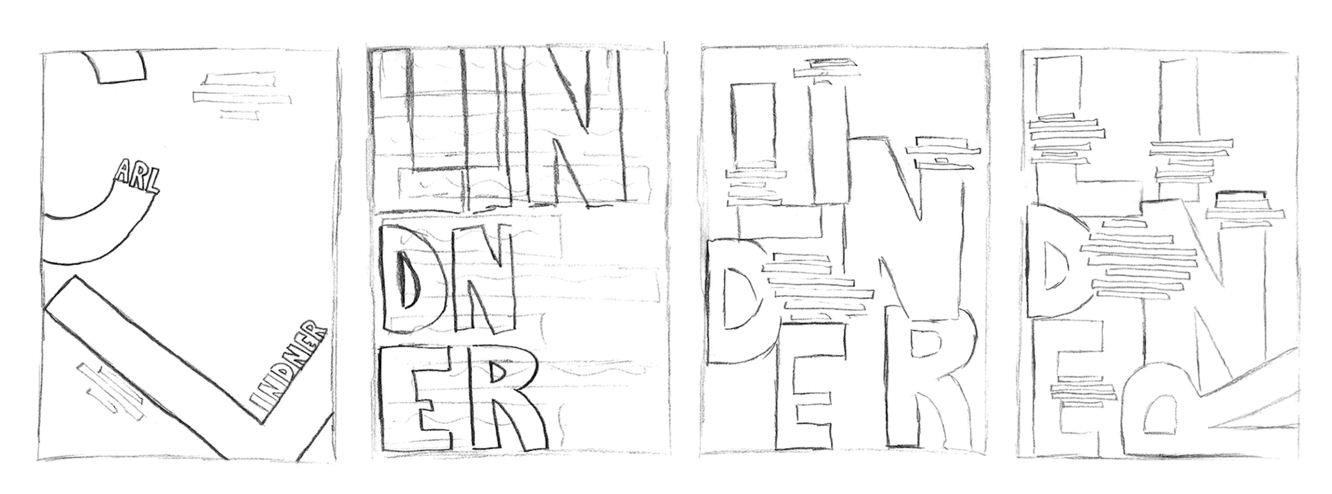
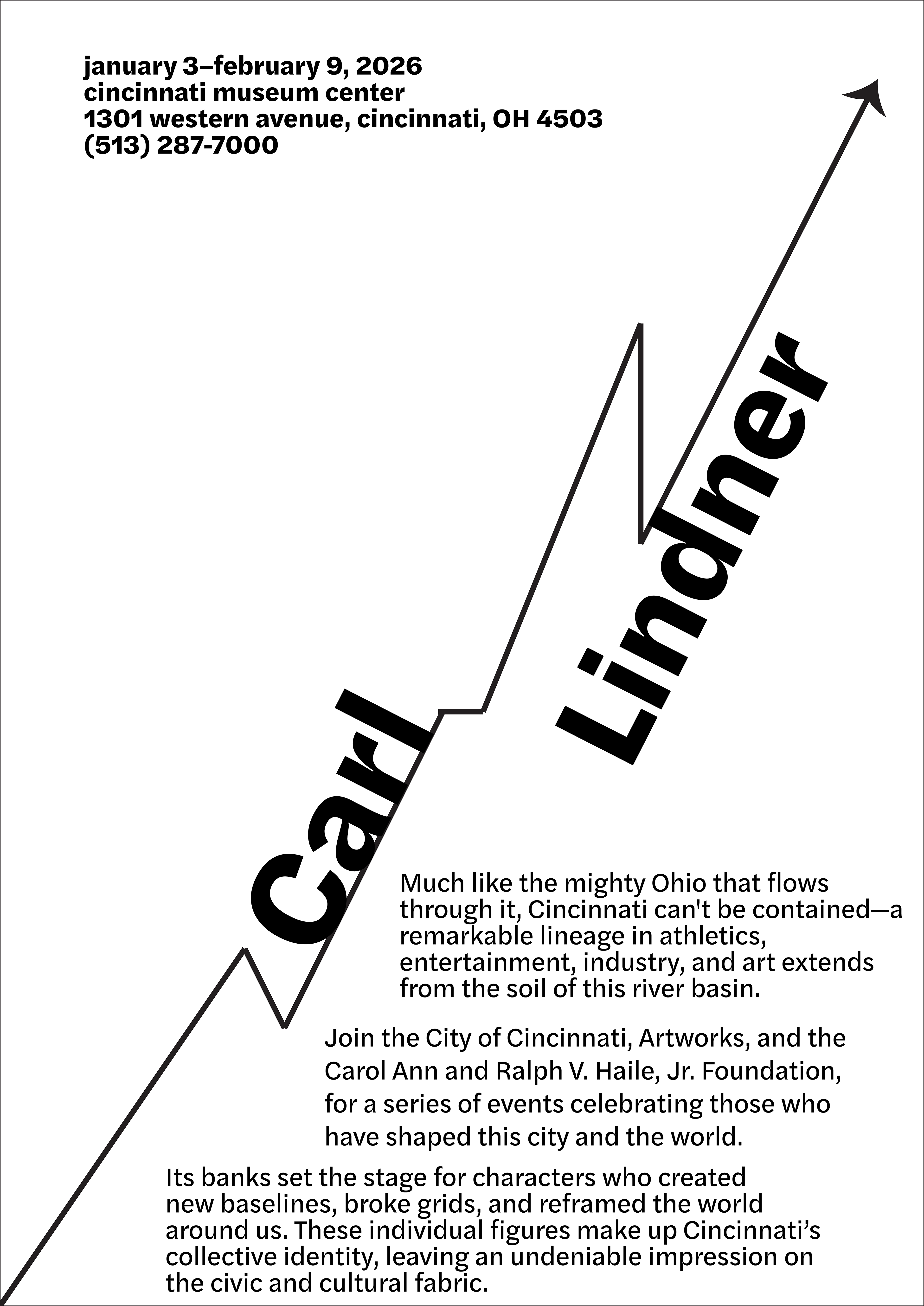
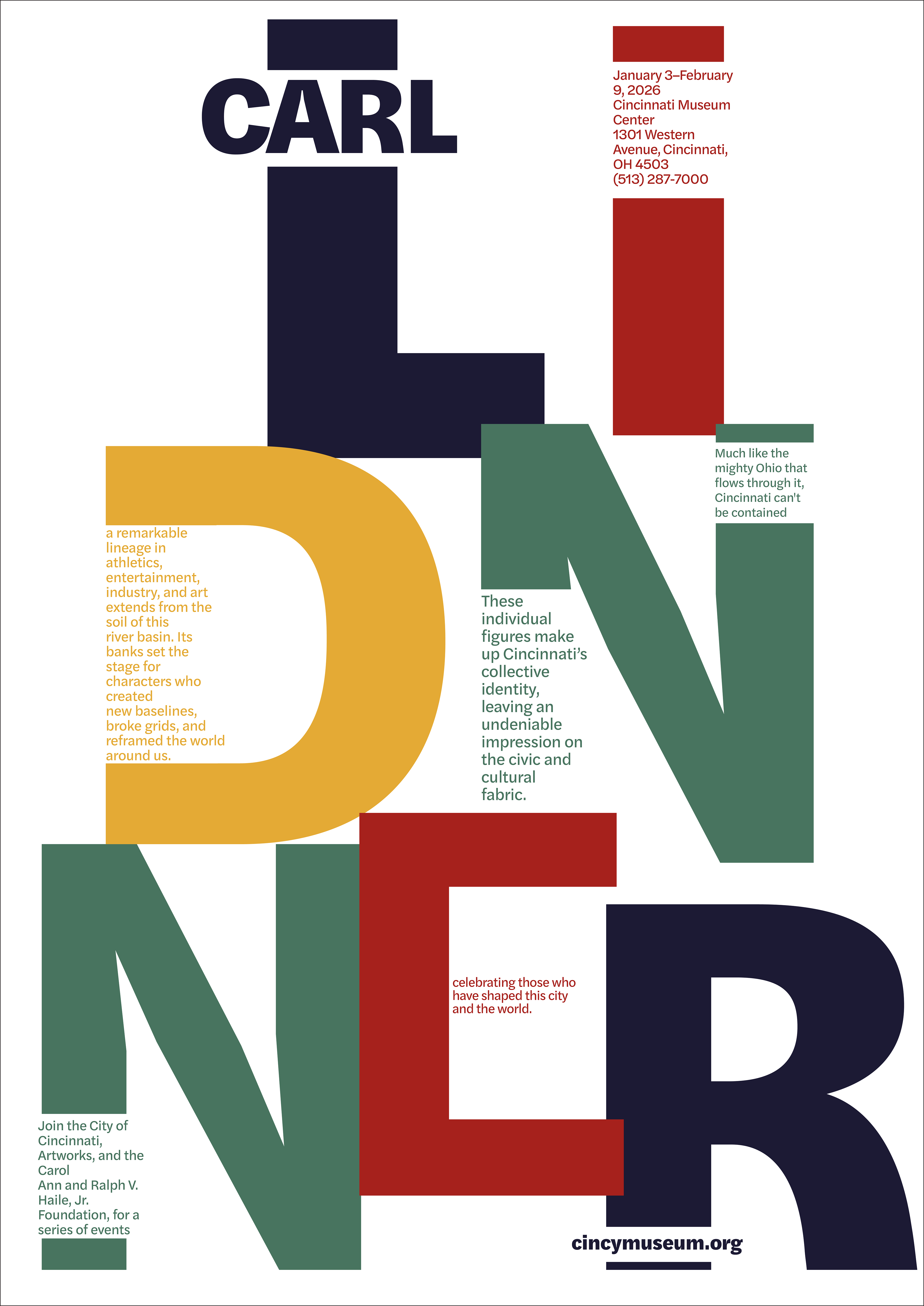
I made the poster visually appealing by allowing negative space to play a role without overcrowding the canvas. I leaned away from creating too much of an image so my typography can be incorporated and maintain simplicity and professionalism.
Typography + Color
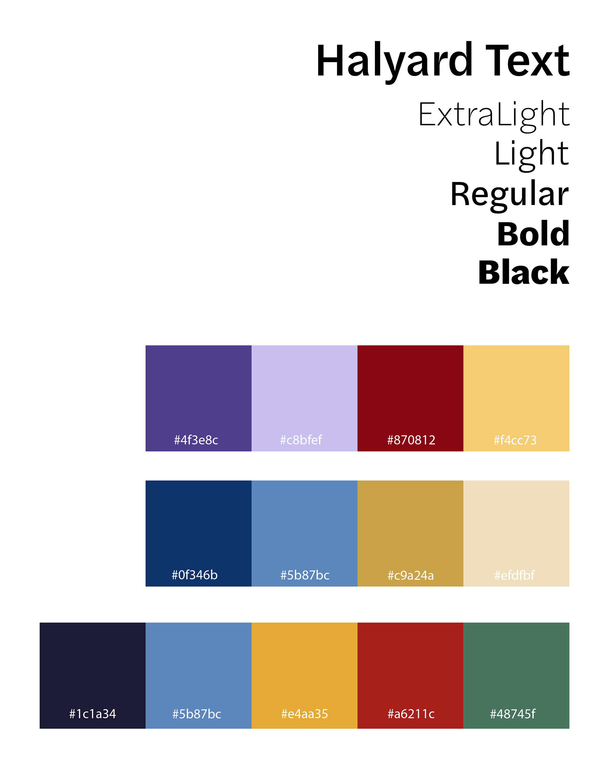
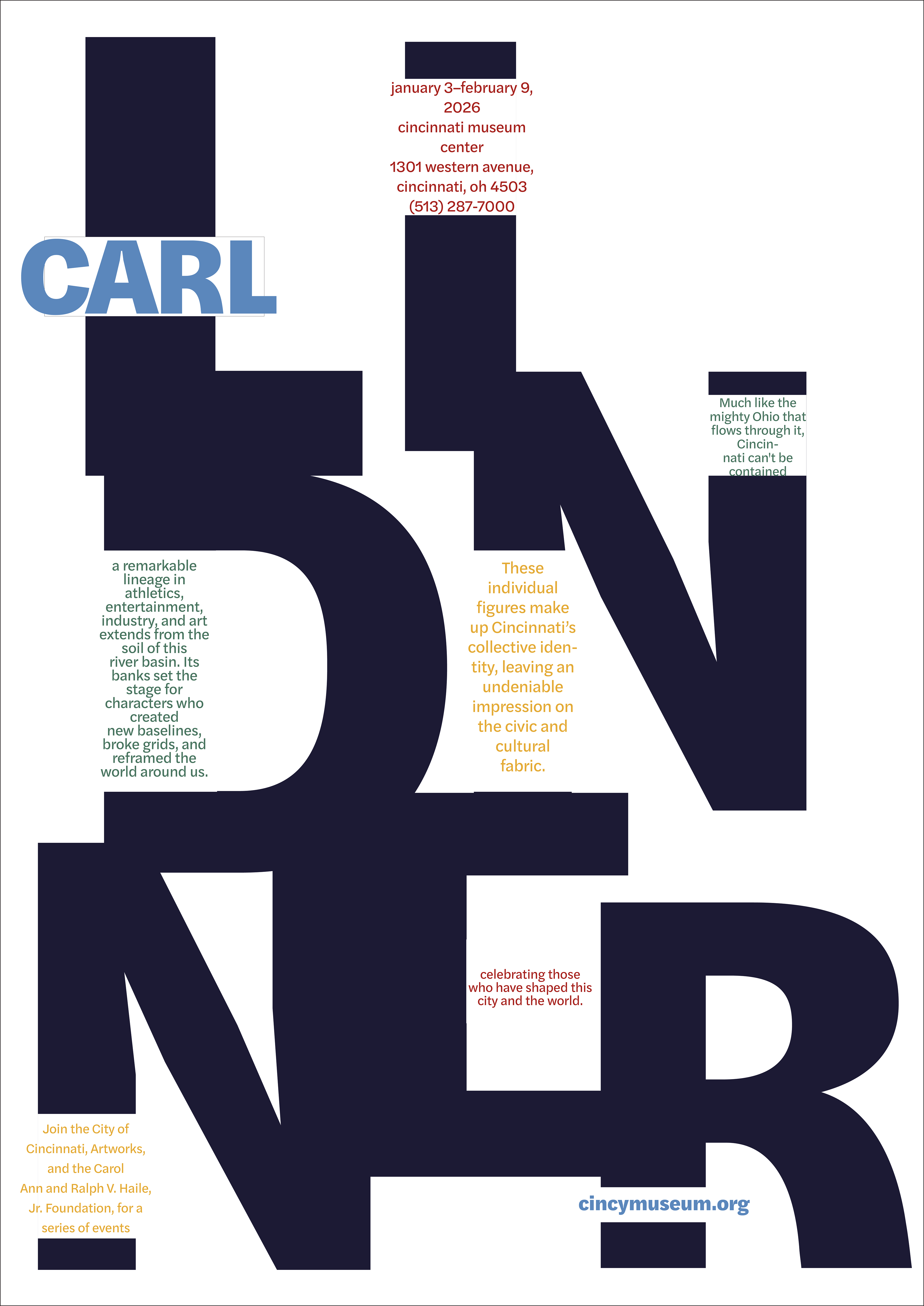
For my typography I used a typeface that was simple and legible to match my overall theme of professionalism. I went with Halyard Text for its refined and functional look.
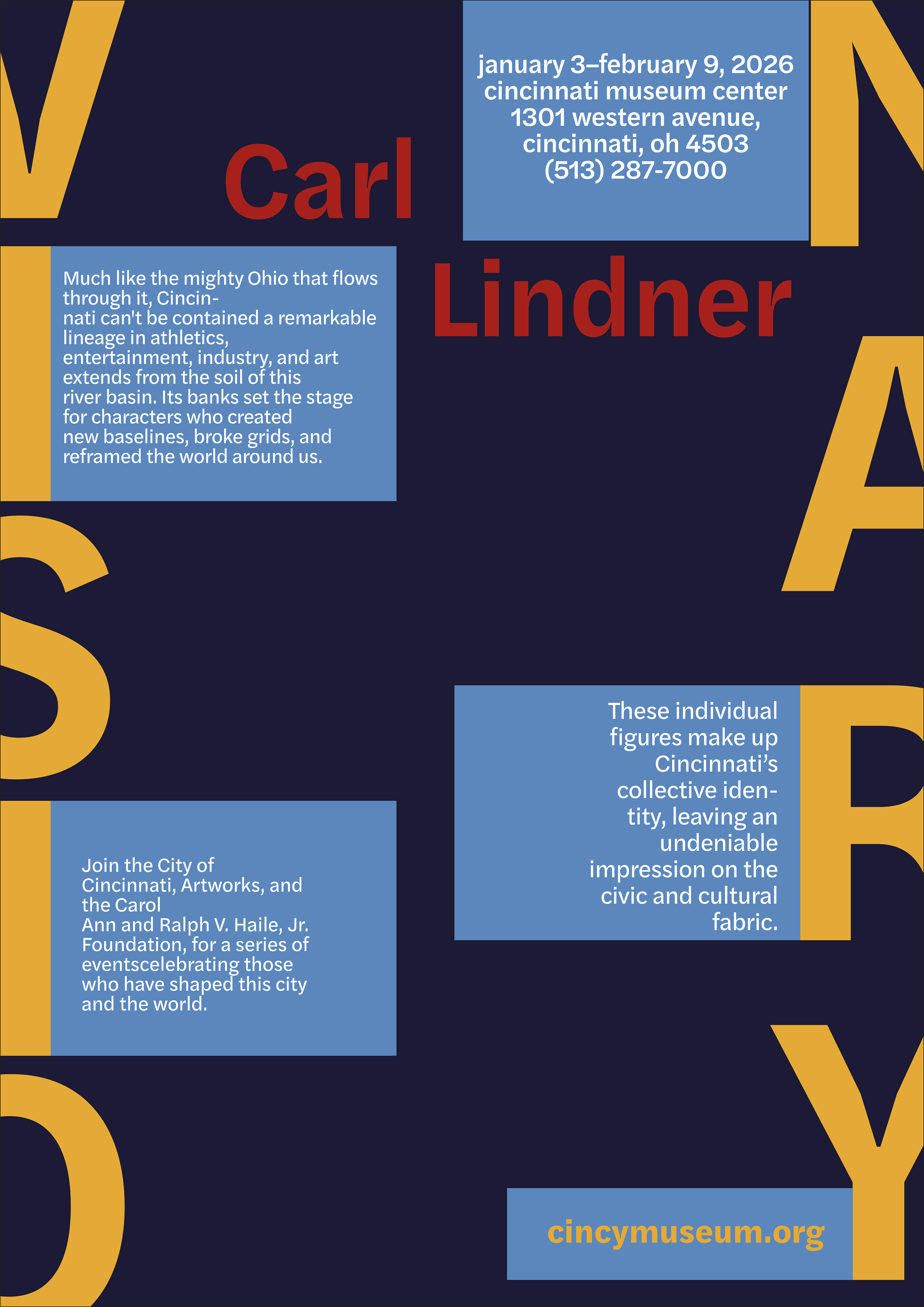
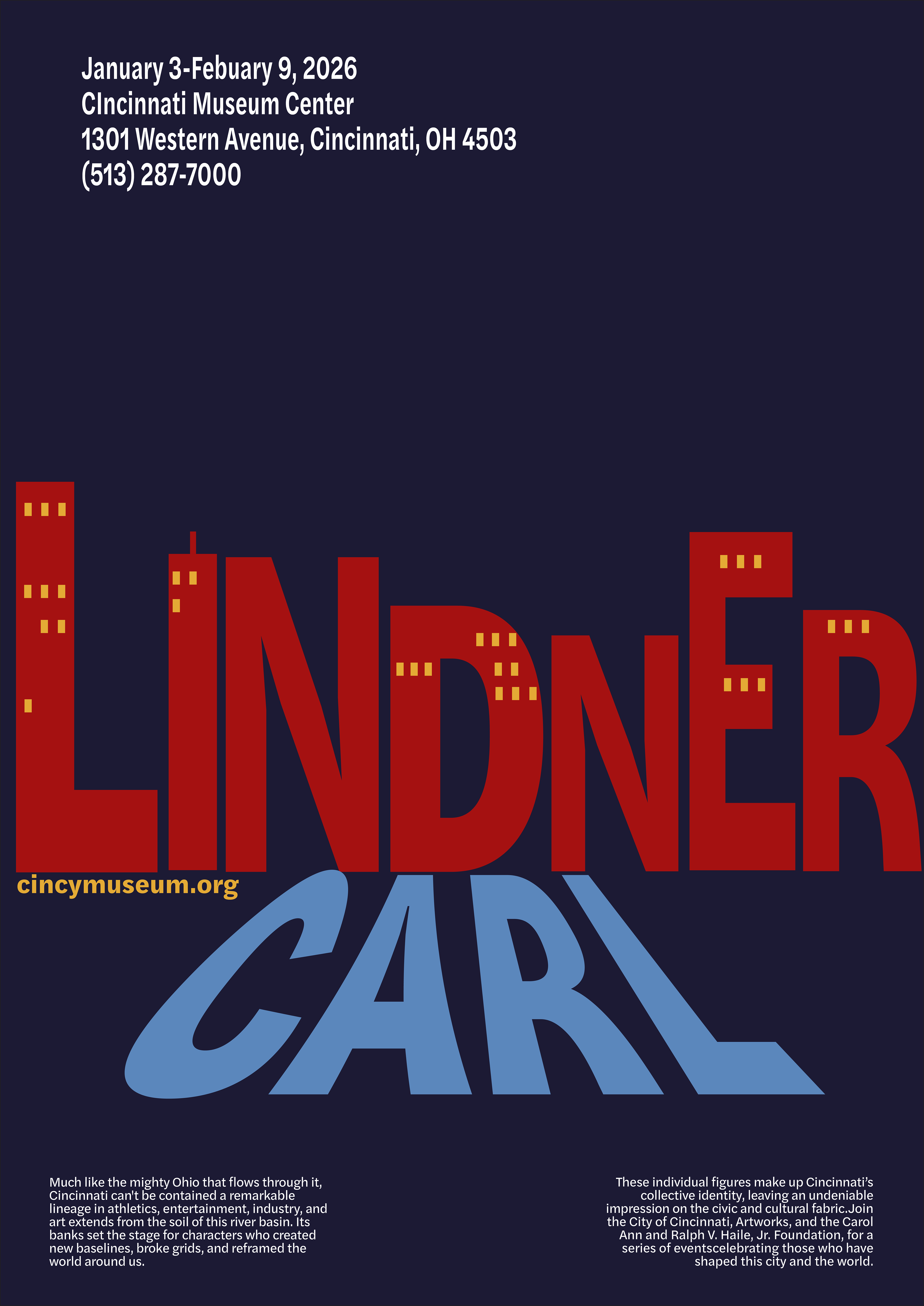
For my color palette I tried out a few different approaches. With the second one I liked the simplicity of the colors, so I refined them in my final palette. I wanted to include more colors while still keeping the professional and business style.
Explorations
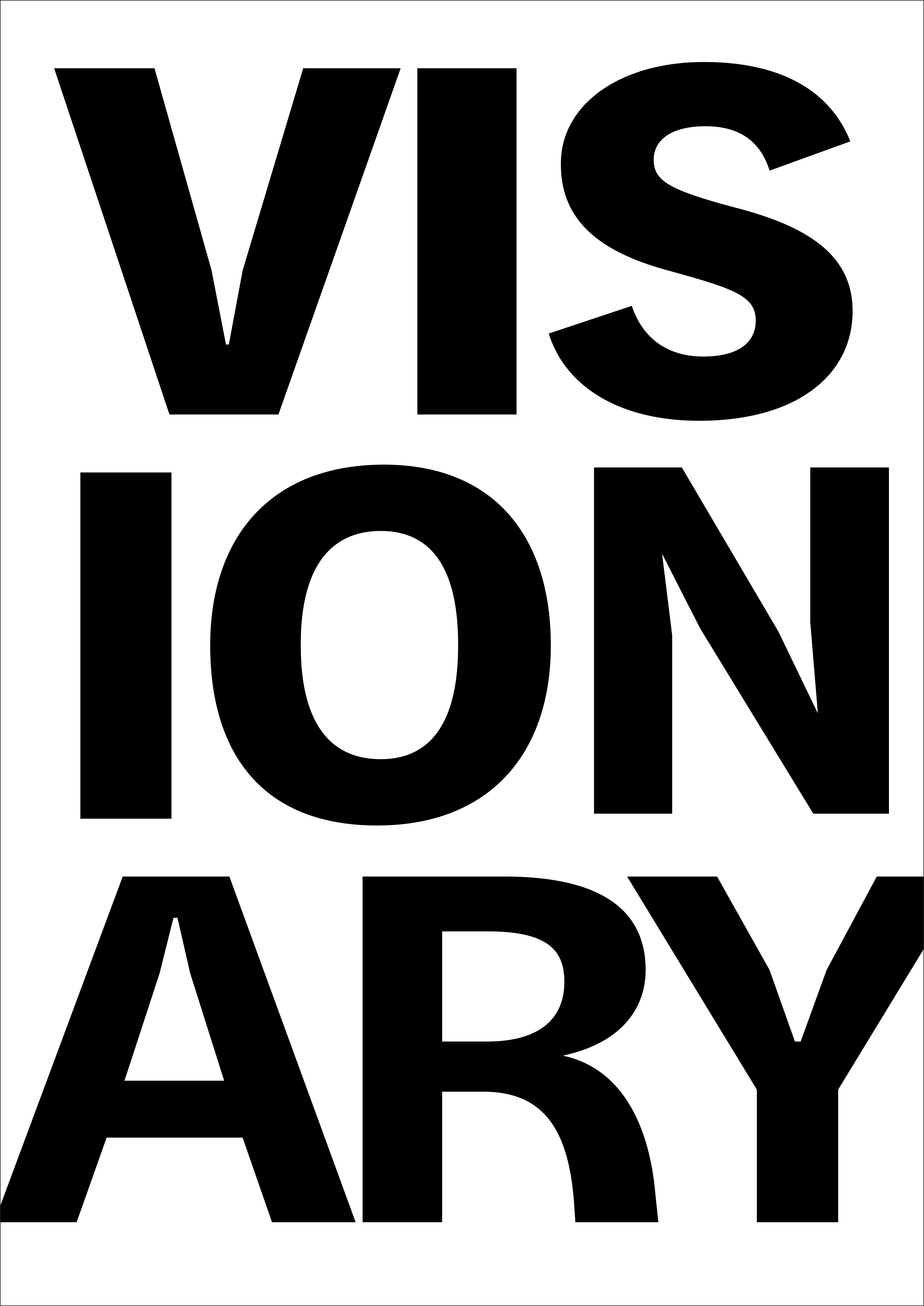
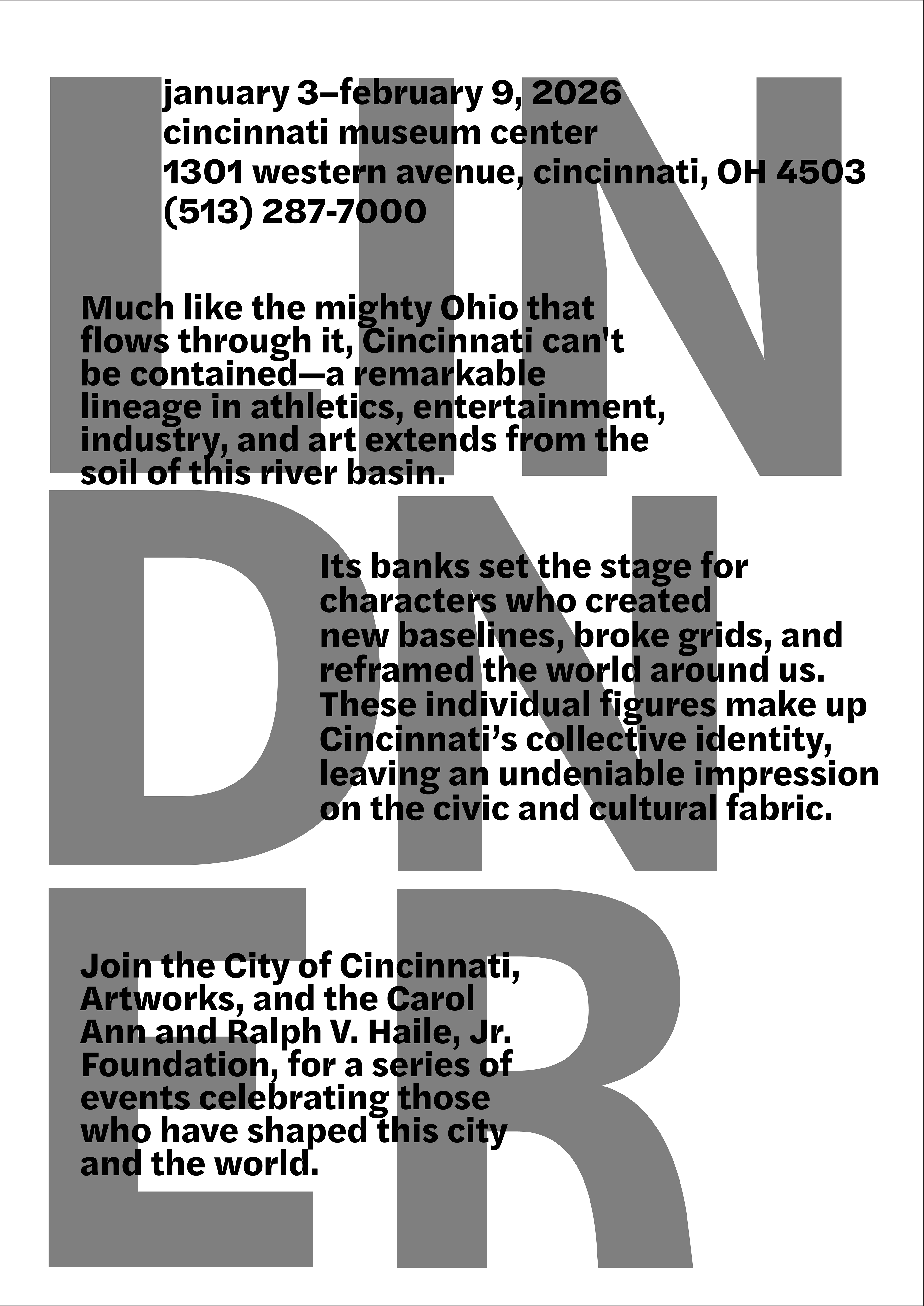
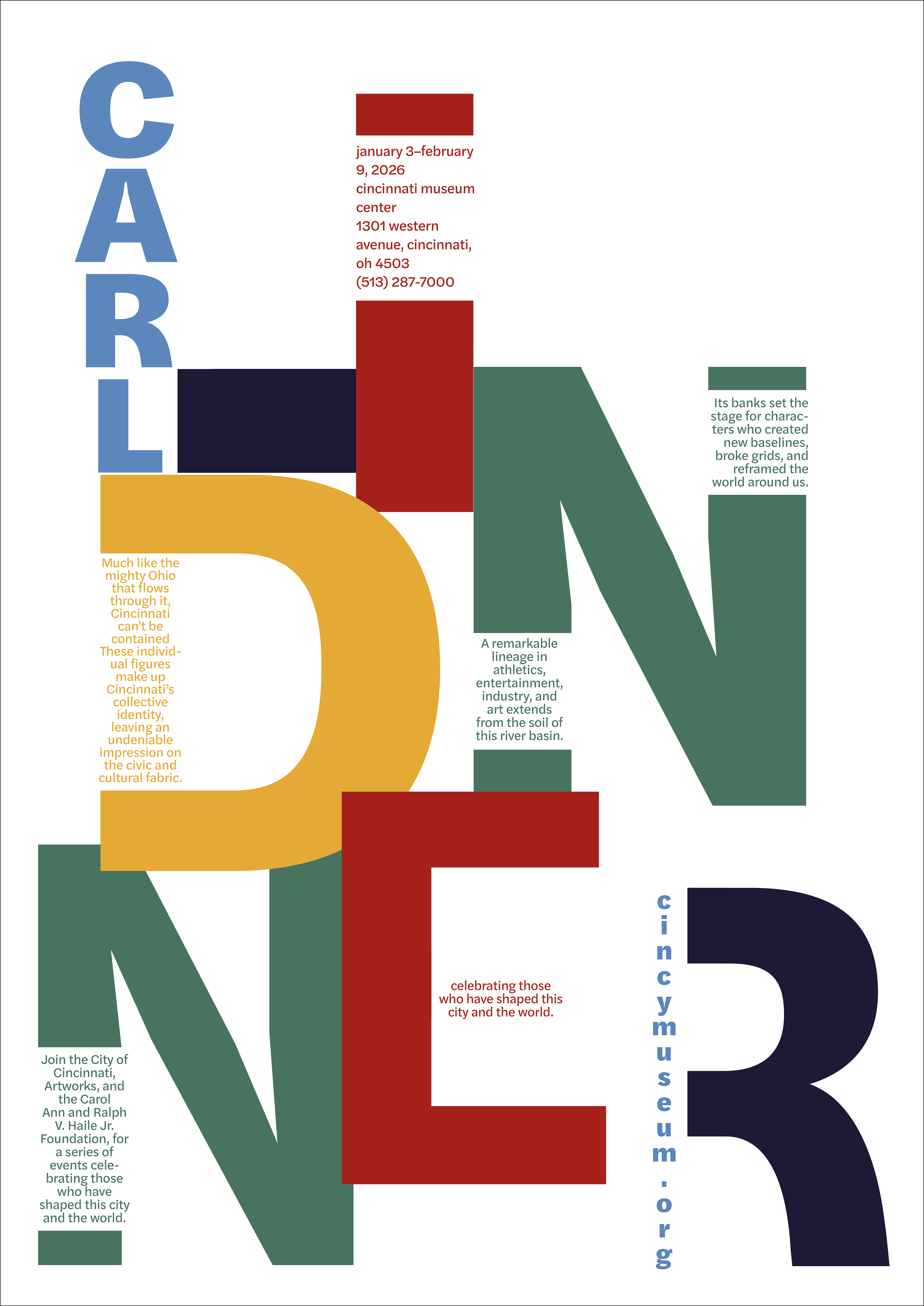
After identifying my direction and color palette, I began rough iterations of the ideas and continued to progress in changes to further push my idea past its original limits. I brought in, and played around with color to change the tone of the design and add more depth in areas it was lacking.
Final