Objective
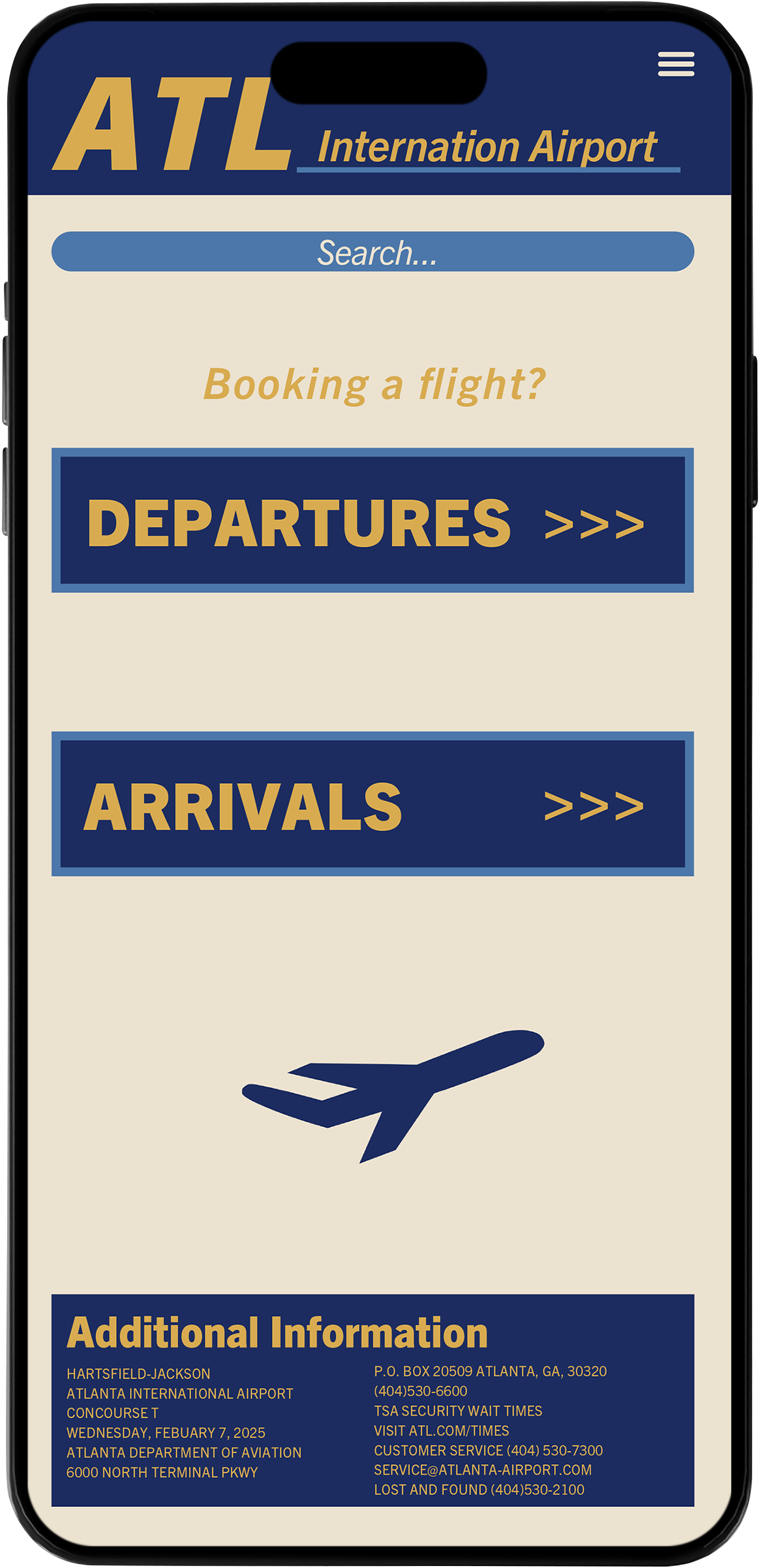
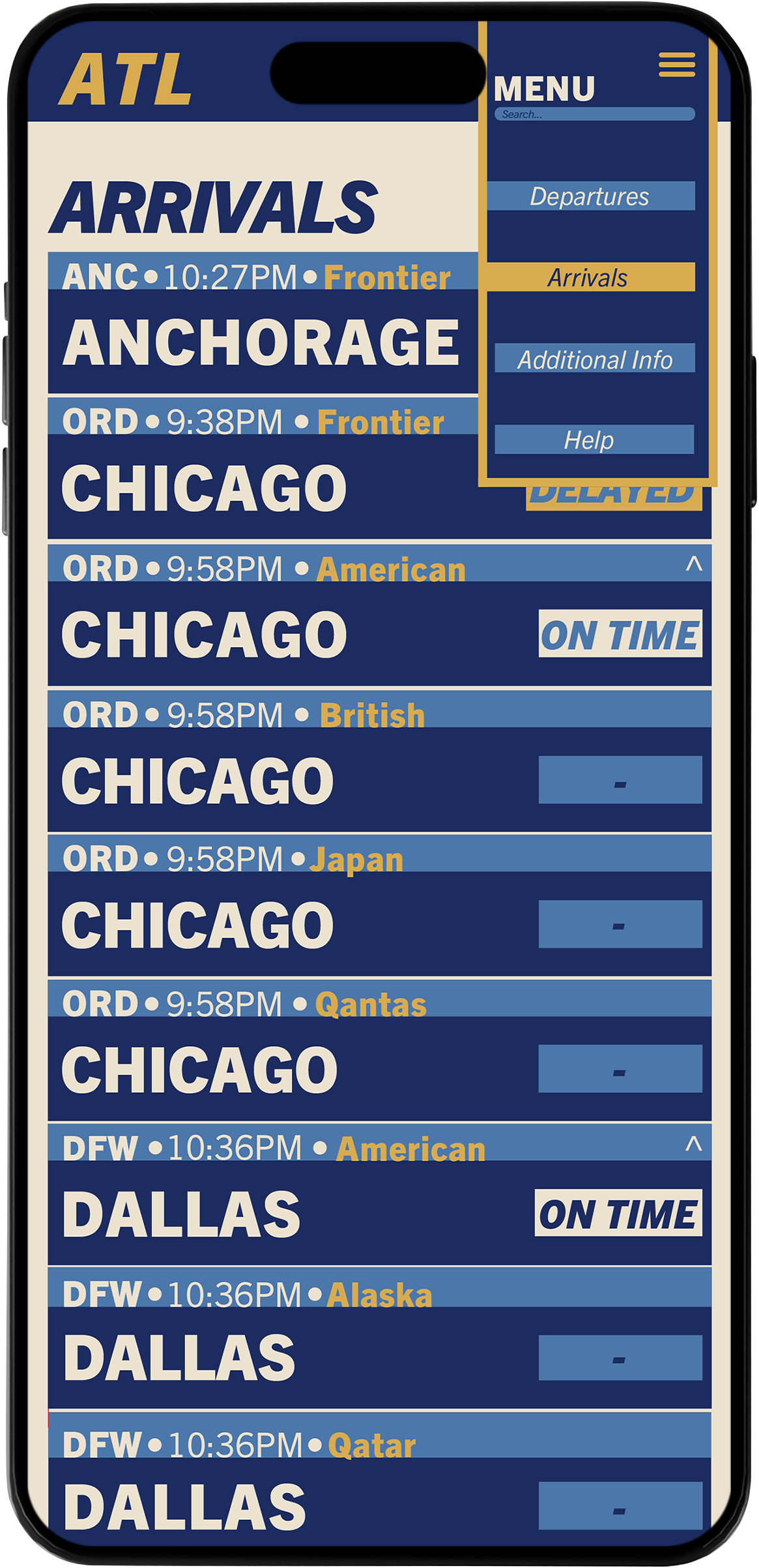
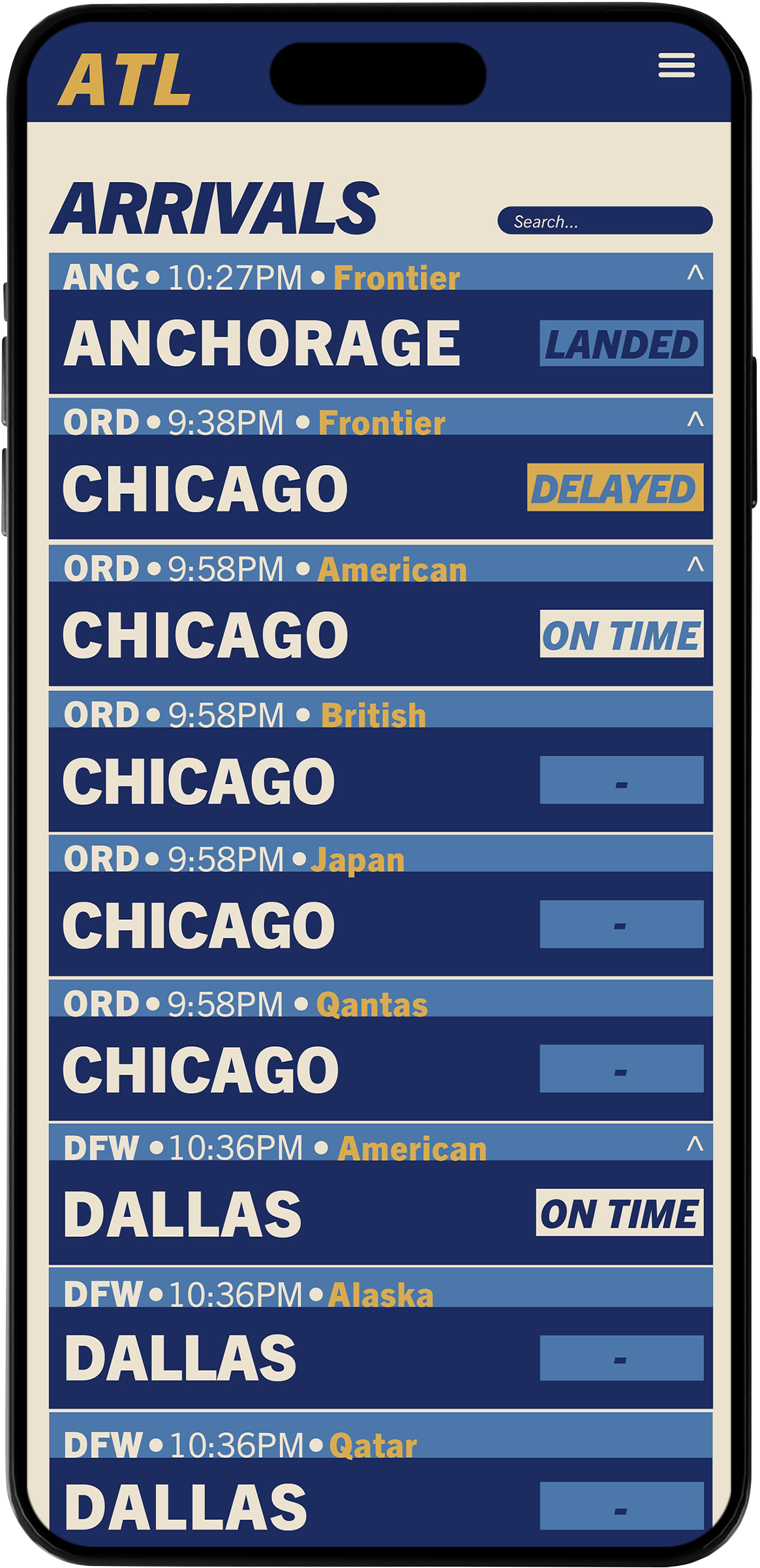
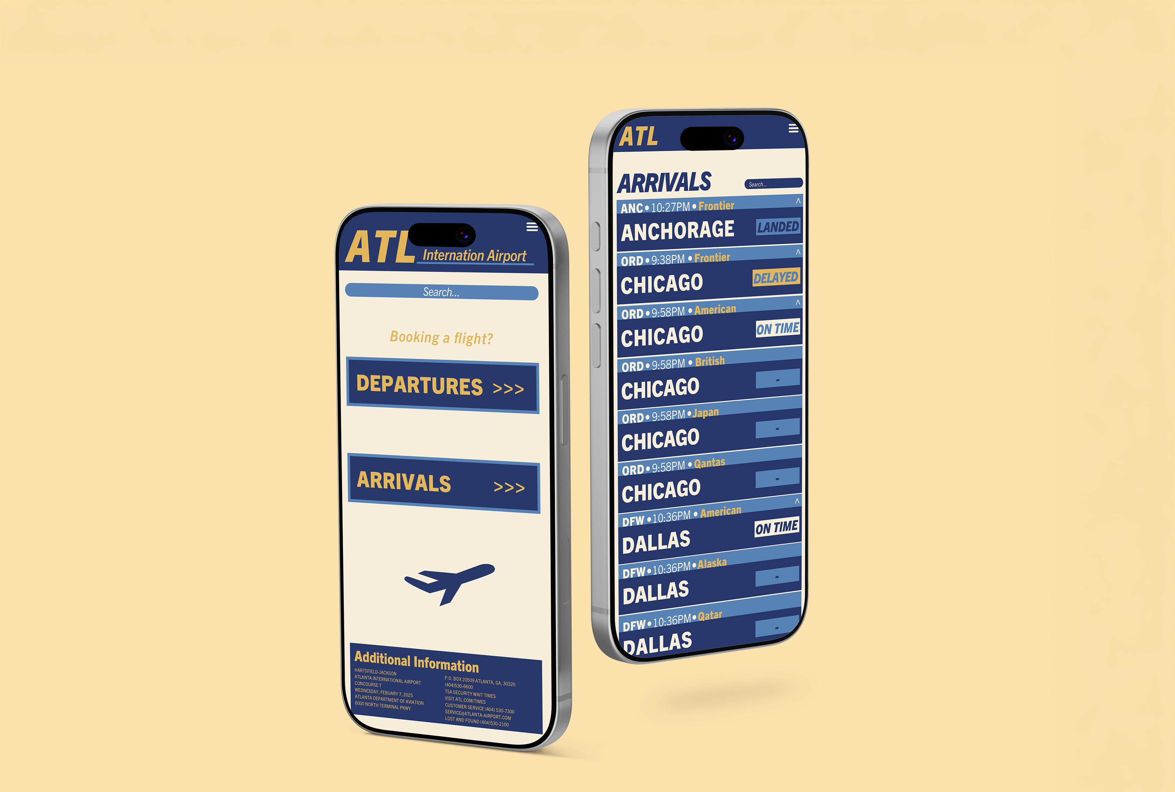
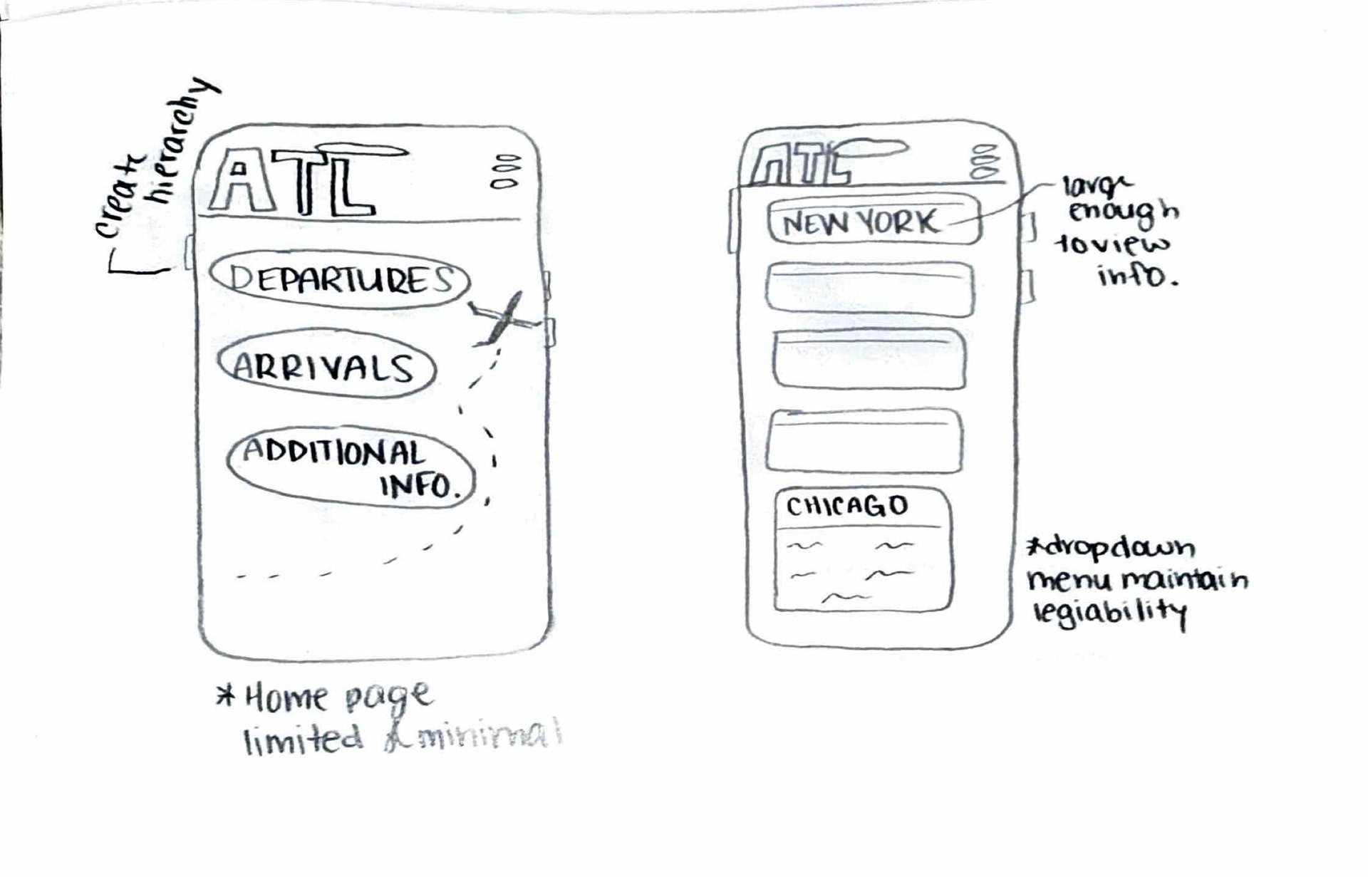
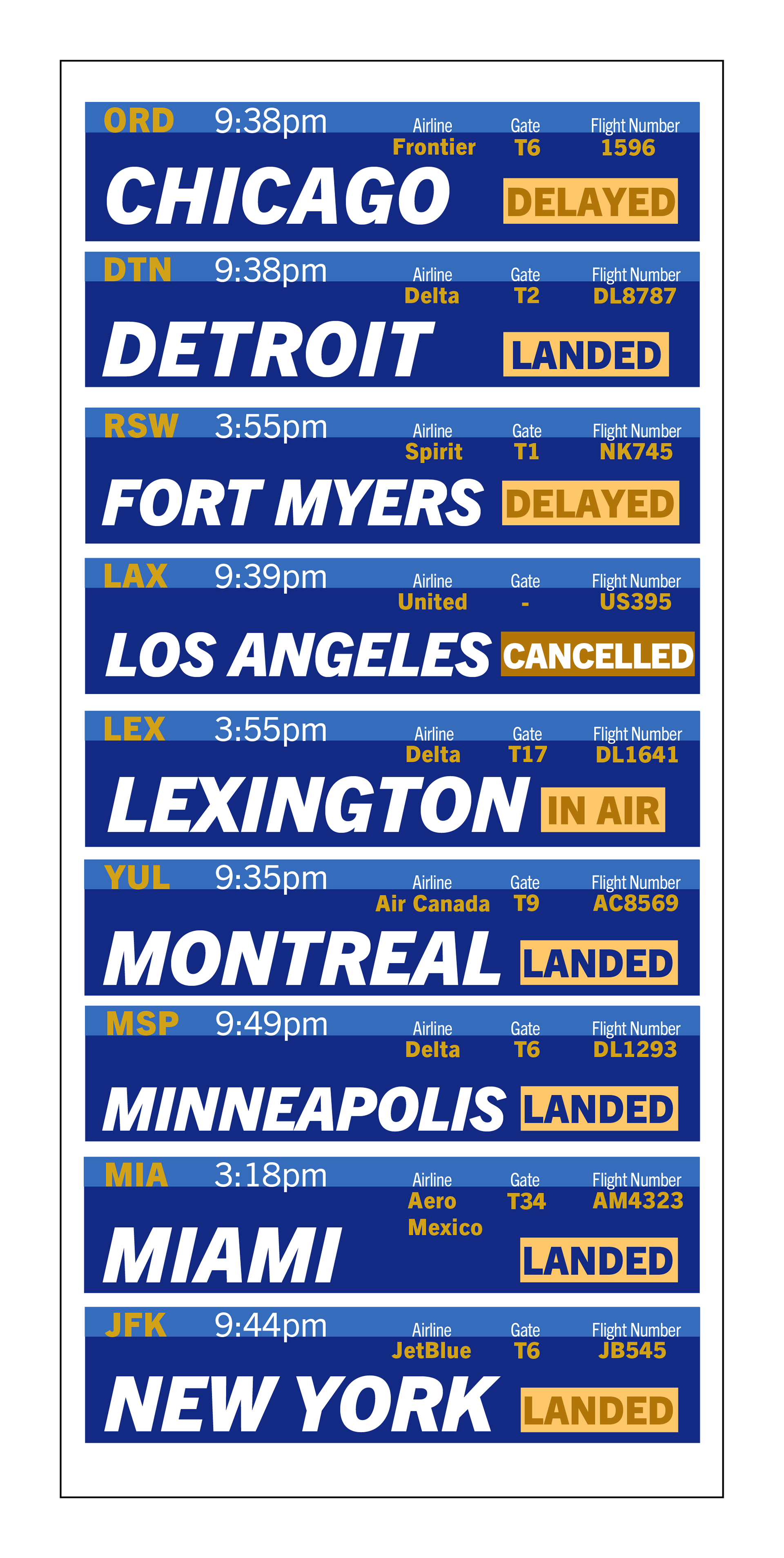
This project aimed to design an app interface that conveyed airport information to a targeted audience. I used typographic hierarchy, a grid system, and color to create a cohesive and usable kit of parts.
Sketches
Color + Typography
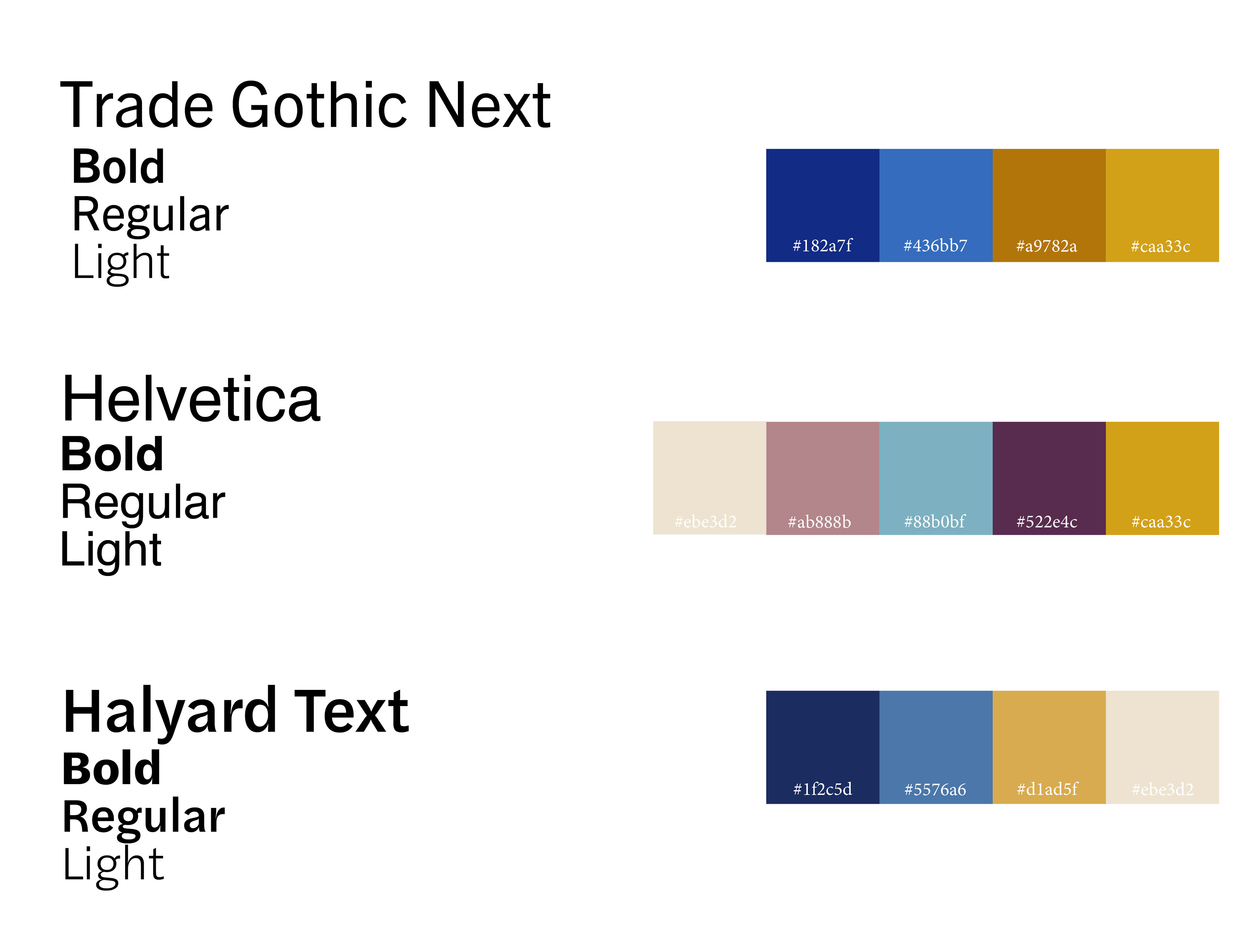
For my typography it's important for the text to be legible in both large and small text. I went with Trade Gothic Next because its clean and functional. My color palettes are designed to be high contrast but still visually appealing.
Explorations
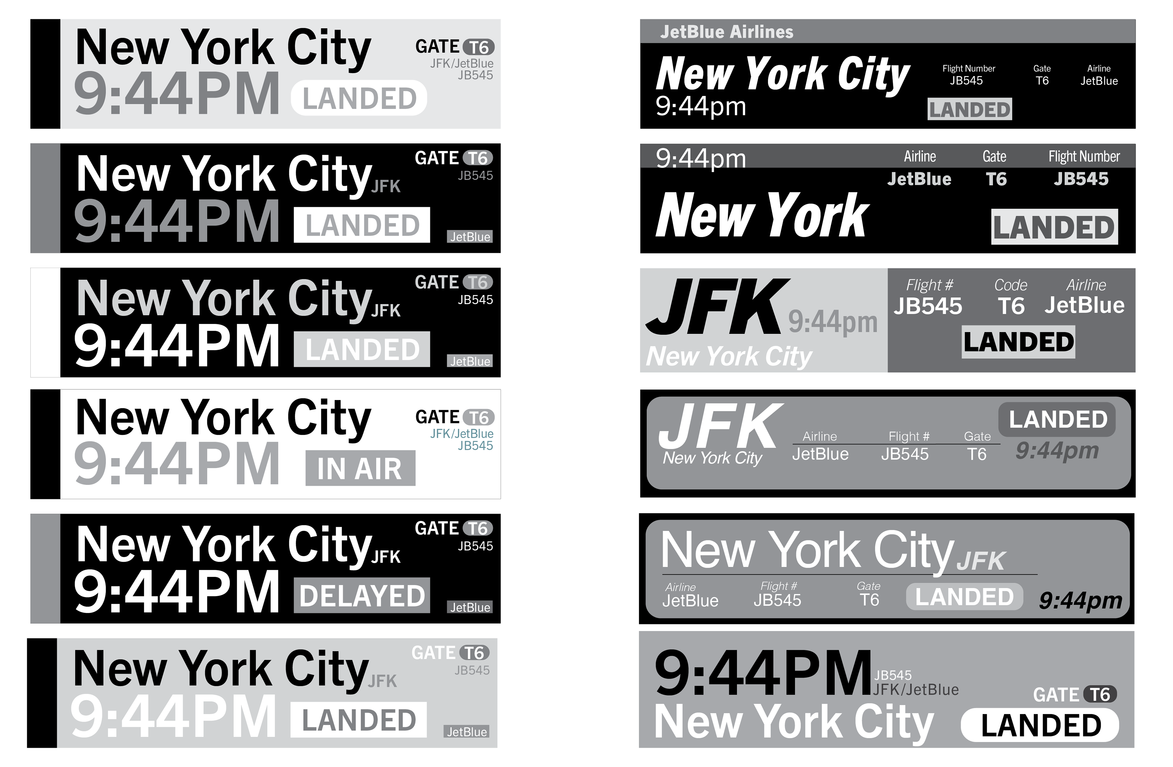
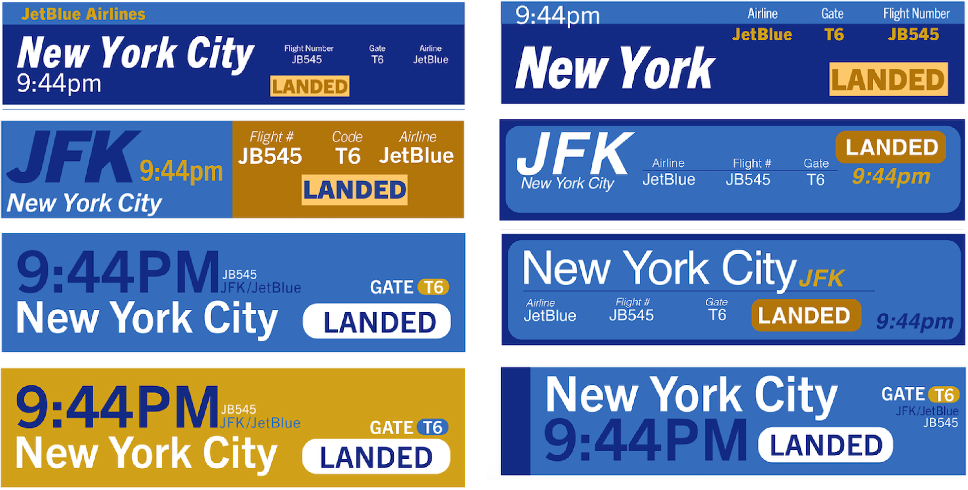
With my typography and color palette choices, I tried out different layouts that they could be displayed in. I played with hierarchy, color choices and typefaces to find what feels best.
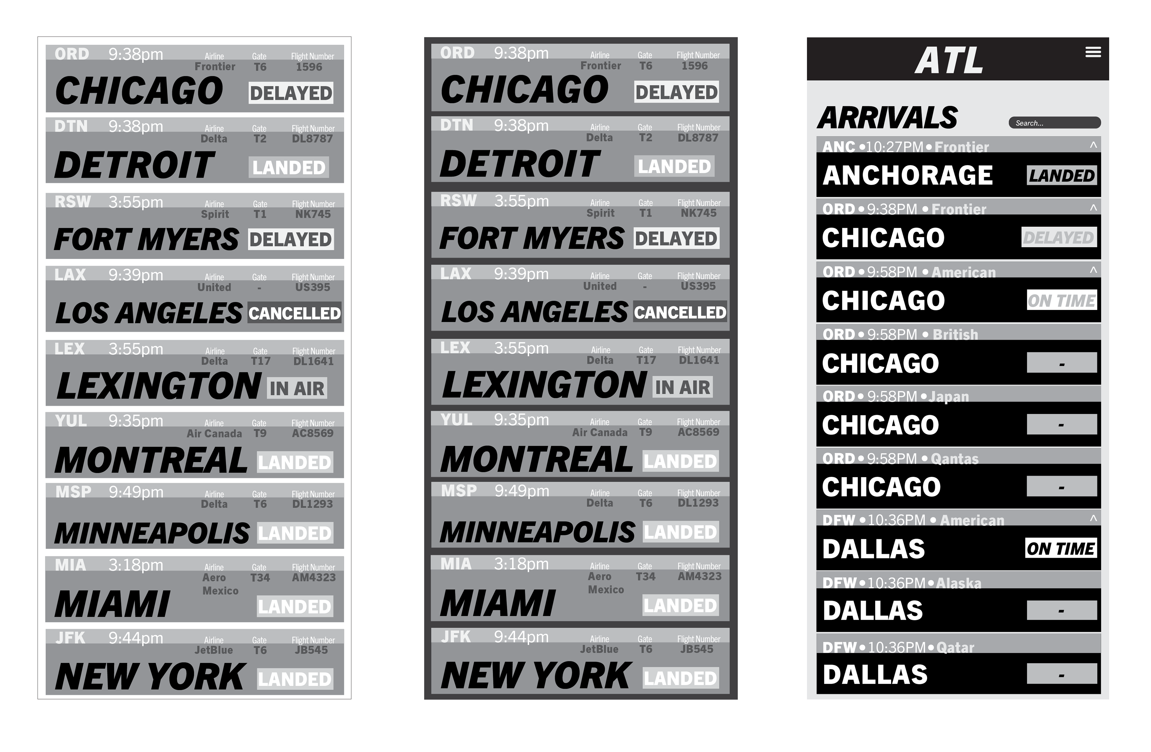
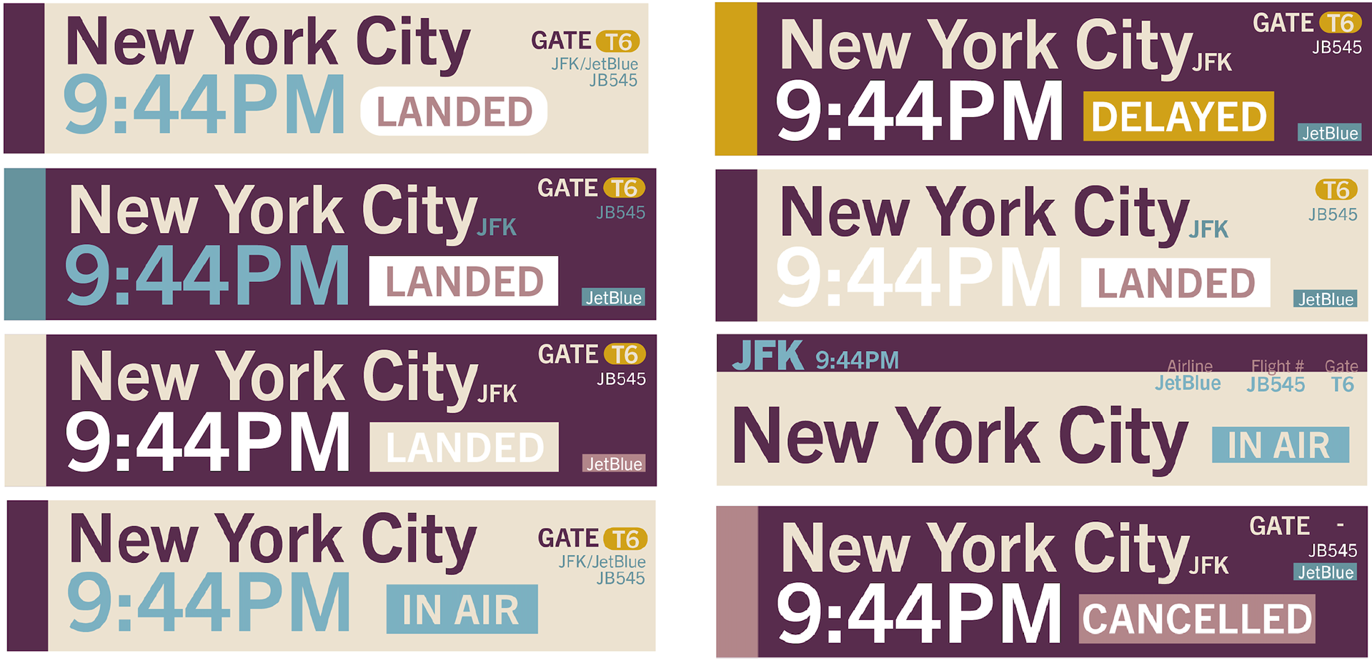
Originally, I went with my first color palette and designed the look of the list. I focused on the more minor details of how the layout will look.
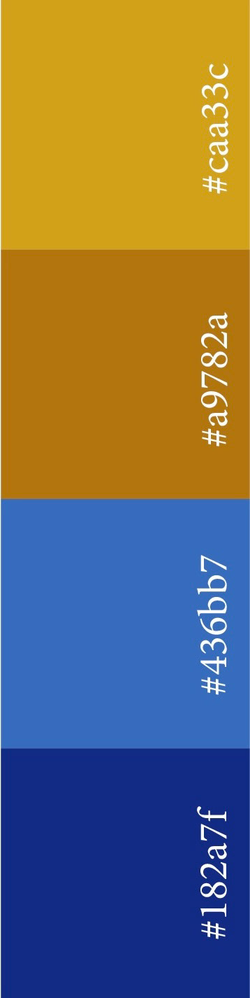
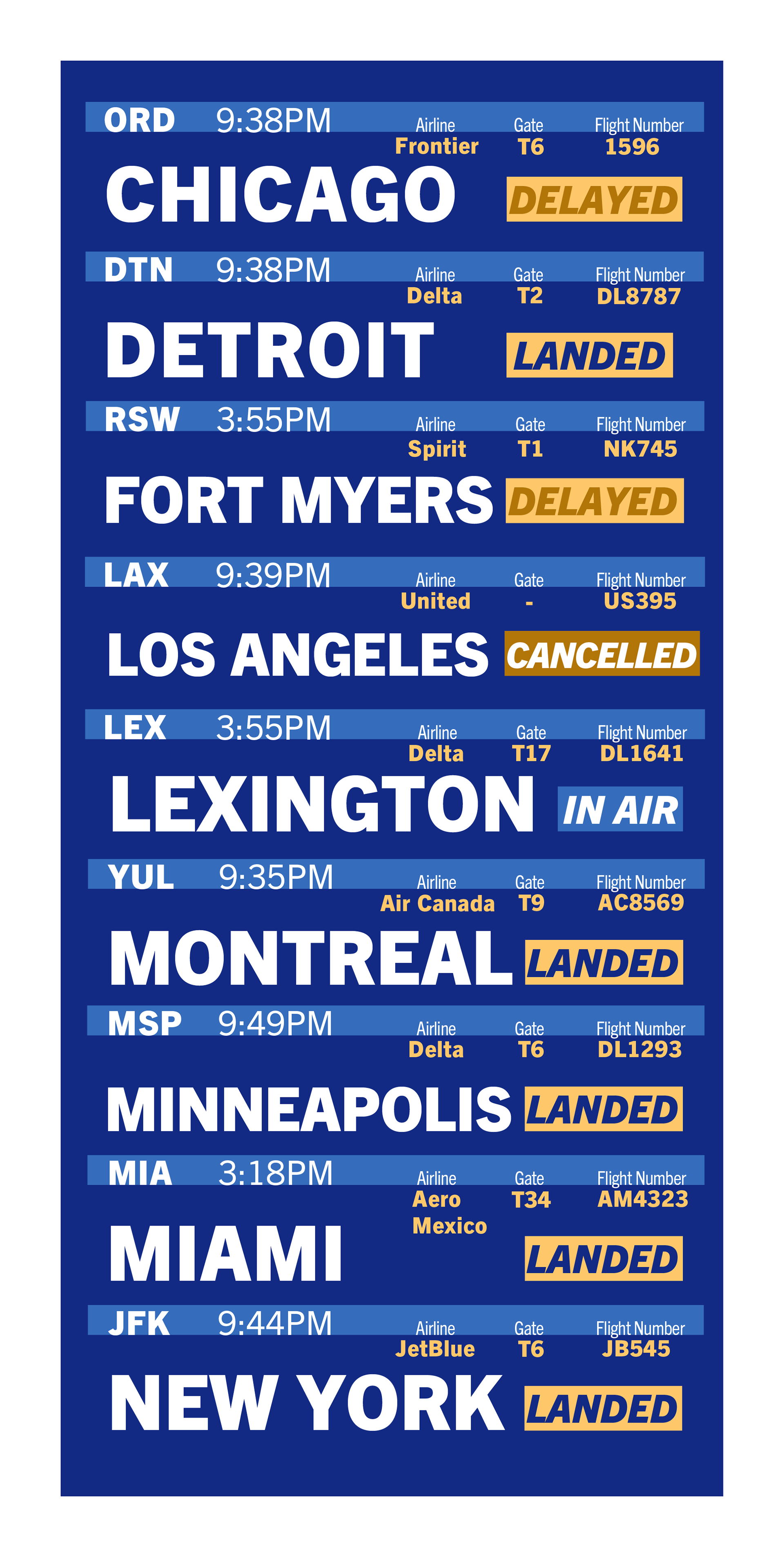
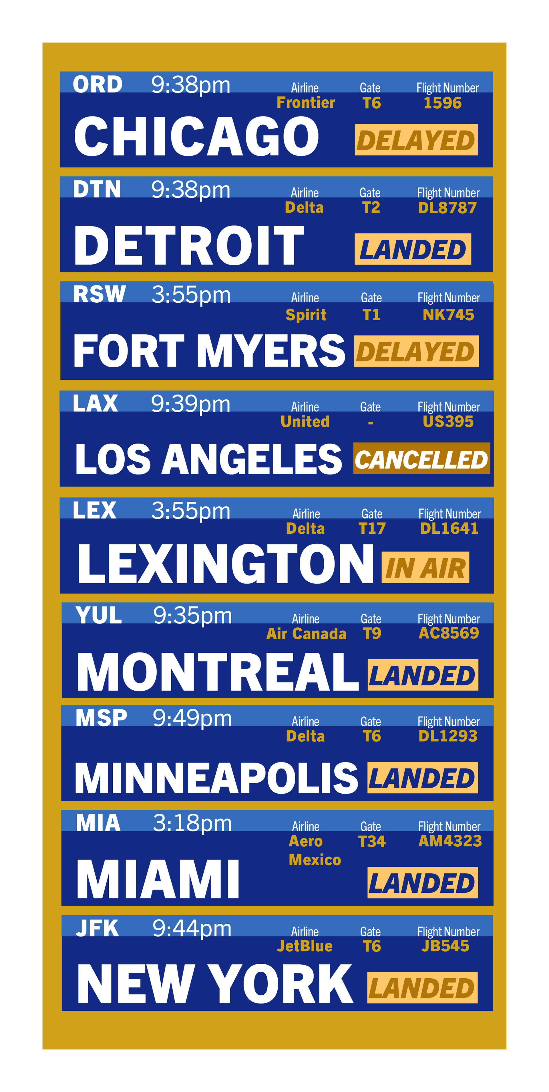
I pivoted directions after not liking the color scheme and process I originally started with. I took the same colors and softened them up so the information is easier to digest and comprehend. I used my new color palette to create ideas for a dropdown menu to find what fit best.

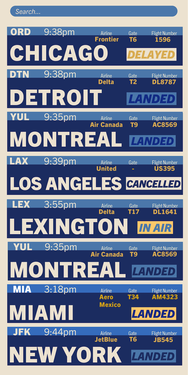
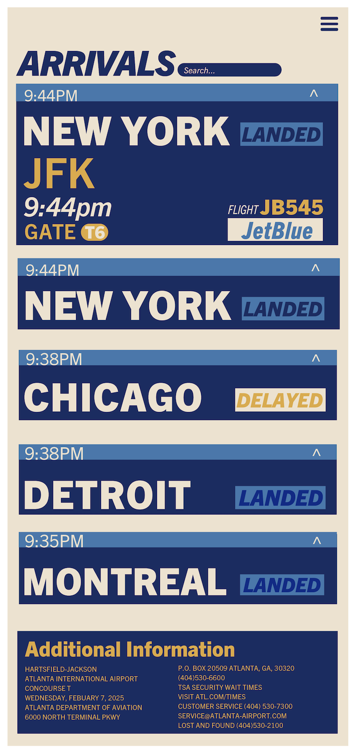
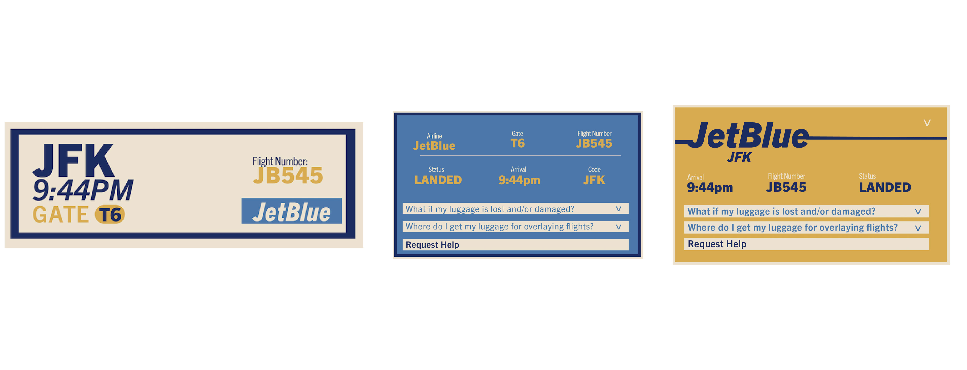
Final